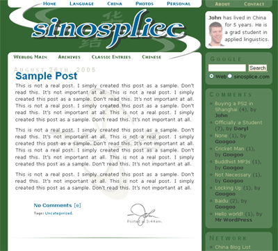
The New Layout
I am finally finished tweaking the new layout. This is it. In a nutshell, the changes are:
– Simpler. Fewer images.
– 2 columns instead of 3. The main column is now wider.
– Color options! (For future reference, the style switcher is at the bottom of the right column.)
The four styles you have to choose from (click them!) are:
- Classic Green (I couldn’t let it go…)

- Faded Gator (Homage to my alma mater, I guess?)

- Toothpaste on Chocolate

- Embers

The style you choose is saved using a cookie. I’d be interested to know which color schemes you like or dislike.
OK, now is the part where I launch into my geeky analysis of the changes I made. Consider yourself warned.
First, I’d like to say that I don’t think this new design is “better in every way” or anything like that. It has some advantages over the old design, but for some reasons I still like the old design better. I suspect some readers will too. But the new design isn’t bad either, and there are good reasons for keeping it.
The Good:
– Color choices. I’m very pleased with this.
– The clutter is gone! The navigation is condensed and 100% consistent. What used to take up a good chunk of the top of the left column is now a few text links at the top. There’s something very satisfying about simplification.
– Believe it or not, the “swoosh”-looking things in the logo at the top were originally supposed to be two S’s, for Sinosplice. Because of the way they were rotated, though, they never really looked like S’s. Now they finally do. Kinda.
– This wider main column will be nice. Sometimes you just want to post bigger images. The side column is wider too, so I’ll have fewer problems over there too.
– If you want to know more about me, you can go to the about page. No need to blather on about myself on this page. Concise.
– Google Search on every page. That should make finding things easier, should you need to.
– Non-blog stuff gone. The idea is to encourage visitors to explore the rest of the site with the prominent menu at the top. No need to clutter up the blog with that stuff. The “recent additions to the CBL” will stay, because it’s sort of like a blogroll, which is bloggy in nature.
– In the “Classic Green” color scheme, the background color of the right column provides better contrast than it used to. I paid closer attention to contrast when I chose the colors for the new color schemes too.
– Quicktags in the comments for easy formatting and linking.
– A tag heatmap in the archives section.
– Valid XHTML and CSS. (I’ll miss you, Flash header!)
The Bad:
– After getting rid of all those images, it does feel a little sterile compared to how it was.
– The top and bottom nav in the header sort of make the logo looked squeezed/cramped. It was so open before.
– No Flash. (I like Flash!)
– No more popup comments. It was just too much of a pain to redo the template, and they’re not at all necessary.
– More ads in the archives.
The Buggy:
– Thanks to IE‘s disappearing list-background bug, the right column is going to look pretty screwed up on the main page for IE users. The supposed workaround didn’t work for me, and I can’t make it go away. Sorry, IE users. This is what you get for using a buggy browser. The good news is that IE 7 (coming soon…?) is supposedly going to fix this bug. (Oh yeah, the other good news is that you don’t have to use IE, people!)
– When you click on a link to new comments on an entry (under “Comments” in the right column), IE does not take you directly to where the comments start like it’s supposed to.
– When you click on a link to new comments on an entry (under “Comments” in the right column), Firefox takes you to the right place, but if you scroll up the the top of the entry, the lower horizontal menu has likely disappeared. If you change the page style to “no style” and then back to one of the four styles, it will be back. This is because the Google Ads trigger a Mozilla rendering bug. I figure it’s not really worth fixing, though, because it doesn’t happen when you go directly to an entry link, and that’s when the top menu would be more important. (I’m also hoping this bug will be fixed in a future release soon.)
– I understand older versions of Firefox may display an extra line of color under the rounded edges of the boxes in the right column. No biggie. Upgrade.
I tested this layout on IE 6.0 and Firefox 1.0.6. I am interested in hearing about any problems in Safari or Opera.
I’m also interested in hearing opinions about the new design.
nice layout. I have a thing for rounded corners. The blog seems ‘cleaner’ now.
I chose the green one. I guess it’s because i’m used to seeing your website in green and white.
looks just fine in Safari, the quicktags thing you got going on the comments is also pretty cool – is it a wordpress only thing.
Oh there is one problem in safari, the comment box is too wide so that as I type this right now it trails off the page and becomes invisible until a few words later when it hits the end and line breaks.
Styleswitcher is neat but I think I’ll stick with ‘classic green’. it really is classic now 🙂
oh btw, since you’re tweaking stuff anyways, why not add gravatars
to comments
I have gone with gator, but I generally do all my own designs in blue anyhow. Just FYI there is no style switcher on the individual entry page. I had to go to the main blog page.
Yeah gravatars.
I feel the amount of google ads is a bit much
Classic Green is horrible. Faded Gator is the shit!
the 4th choice is bad, i still prefer the original green design, but if you decide to change it, perhaps you should go 3rd choice, the coffee color
It looks good on Safari! Faded Gator is damn cool. It might seem more sterile, but that isn’t a bad thing, it is nice and clean.
Thanks for the feedback. Originally I was going to add gravatars, but they gave me trouble. I may still add them.
Hobo,
Yeah, there are a lot of ads in the archives, but I designed in such a way that regular readers should see virtually no ads.
i like the “classic entries” link. if you had this option before on the old layout, i am sorry to say that i had never noticed. when i reviewed the titles, i couldn’t help but to think that the collection was akin to a “sinosplice: the greatest hits.”
yup.
they’re classic.
while i went on an on about how much i liked the green layout, i have opted for the black color-scheme. i think that in the future i will change back and forth between all four choices.
but for now: black.
I hate the gaytors, but I have opted for the gator color scheme because it makes me feel young and sassy.
I chose embers because it matches my soul. Dark and disturbed. With the exception of that overly chipper picture of you in the upper right corner this color scheme is a perfect match for my sullen evenings at home Gothing it out with all the Goths doing Goth stuff, talking about vampires, listening to Type O Negative and eating salsa. Extra chunky…all right. Count GOTHChocula out!
I found embers more Emo than Goth. However, I do wish we had a chunky salsa layout option.
Doom,
Emo, eh? Yeah, that’s a little closer to me than goth anyway.
A chunky salsa layout?? Hmmm… Sounds difficult. How about I just toss you this link instead?
http://www.salsaderosa.com/images/salsa%20pics%20003.jpg
Don’t you dare call me Emo you stump-legged hillbilly. My Live Action Vampire name is Luciferious Debauchery, I’m a level ten minion of his unholiness, Dracula. I only drink red wine out of the most evil of opaque goblets Bed, Bath and Beyond has to offer, and live in only the dankest part of my parents’ basement. The Emo breed has not the spine for our dark, brooding lore and Florida’s humidity. My Life with the Thrill Kill Kult could beat Death Cab for Cutie in an evil rock out any day. This I feel in my very soul, from my rouged lips to black fingertips. Layeth down your jugular for my consumption Doom. This you cannot resist, also I’d like to say that a chunky salsa layout option would be super sweet.
So as I was listening to Copeland and Underoath, I readjusted my new studded belt, finished off my falafel, and decided that Greg wouldn’t need to kill me. I love Emo and I’m close to killing myself anyway.
Back to the layout design. After keeping it on the Gator Blue for a while, you know, just trying it on, taking it for a test drive, I decided it made me look fat. I am now experiementing with the poetically named “Toothpaste on Chocolate” which also sounds like the name of a new Spike Lee joint. I hope this works for me because I am quickly running out of layout options, and let me make this very, very clear: I will never go back to Classic Green. Never. Ever. Green is the evil color of money and decay that makes my soul die. Green is the color of life, and all I see is death around me. Green conflicts too much with my angst. I will commit suicide before I got back to classic green. Which I may do anyway because I broke up with my girlfriend last week after catching her listening to Mall Metal.
After seeing that picture of chunky salsa, I’m sure its a theme that you could use, John. Just think about it man. It’s important.
love jamie
PS Greg, I hope your house in Florida was blown away by Hurricane Katrina, and with it, all your black t-shirts. Oh, and thanks for agreeing with me about the salsa
Jamie,
Truer words on the weakness of Emo have not been spoken. John flys the flag of cowardly rock. Only after he bows down before the Sword of Goth and the Triple Xed Jugs of your drunken, Smokey Mountain hoedowns will he believe and understand the power and beauty of the Chunky Salsa color scheme.
John,
Classic green is a one-armed, syphilitic whore with a club foot and crackly bones. Classic green torments my mind with a plague of a thousand worries. Truly the Lance of the chunky salsa color scheme can exorcise the demons of that aesthetic misjudgement. It’s acid in my eyes, shampoo in my urethra, the roof of my mouth after a big ol’ bowl of Capt’ Crunch. Lay this hateful dragon to rest and give birth to the chunky salsa.
P.S. Loved the hurricane crack Jamie. I’ll have you know my house and the black T-shirts emblazoned with obscure band names are safe and sound. You know I had some gift certificates to Pier One I was going to give you but now you can forget it. They were having a sale on decorative barrels. I thought you might be able to use them to spruce up that squalid, broke-ass log cabin you dwell in, gnarling your fingers to nubs on your wash board and deadening your palms with a hambone no one wants to hear. The Oak Ridge boys suck! Deal.
Greg,
I know you aren’t Goth–you brought a Swedish loofah with you all the way to China. You were metrosexual way before that was a term, and people called it what is it—“in the closet.” Also, I know you don’t have any Goth t-shirts because Goth t-shirts don’t come as white wife-beaters. I do miss your spaghetti though, I’ll say that. Nobody knows al dente like you. Of course nobody else’s hair is al dente either. Also, don’t knock North Carolina too much. Soon you will be joining the whining, Florida masses immigrating here searching for…dry land. You have had seven hurricanes in two years. Your state is uninhabitable. You are coming back home to the roof of your house, c rations, and a $45.00 gallon of water. Deal.
John,
I appreciate you giving us a choice. I really do, but now I have seen what Sinosplice:The Weblog can be; there is no going back. Also, I have done some checking around, and it’s not that hard to draw two s’s so that they look like two s’s. Seriously, don’t act like it’s hard. Also, I bet as you are reading my earnest comments, all around you is the muck and waste of Classic Green. You have three other options yet you can’t let it go. Move on, John. This is a new day. You are a school boy again. You have a new layout. Greg and his loofah are finally fleeing China. John B. is married, and Carl still sleeps all the time. It’s time to think about the love and the serendipity that is Chunky Salsa Layout Design—in 2005. Scrap the Green, get with the scene, get Chunk Salsa; it’s mean, lean, better than Listerine, and would probably be loved by Ben Vereen
and Charlie Sheen.
Yeah!
Love Jamie
PS Greg. I bet your people could make some good Salsa if they ever tried.
Jamie,
Touche, my good man, touche. You indeed have my number. It’s a three digit “area code” followed by a “series” of seven subsequent, single-digit numbers. It’s called a “phone number.” Not unlike the rusted out Shlitz cans and fishing string you use to communicate with your slack-jawed, backwoods brethren, but without all the pig calls and yodelling jingo-jango that passes for speech in your part of the country. Ah ding-a-dang-dong. All joking aside though:
John,
Chunky Salsa design 2k5. Grab this proverbial bull by the horns and run with it. Classic green is as dead as Zubaz and tapered jeans. Classic green is Richard Simmons’ Salad Spray, which is to say, it has long since rode the midnight train to slab city. Turn off the life support. Chunky Salsa color scheme is the wave of the future. It’s like jazz (a wink to Jamie). It’s all you can eat buffalo wings night at the Booby Barn. It’s like our Lord and Savior, Jesus Christ. He died on the cross for our “Classic green” sins. This new layout is tops, which I think is British slang for “good.” Why hold back with the moldy old classic green when Chunky Salsa is waiting in the wings to deliver you to the promised land of Chunky Salsa goodness. The time is now. And the “now” is delicious Chunky Salsa. It’s like taking a bath in blue cheese dressing and wishing you were one big ol’ carrot stick. Go with it.
P.S. I just wanted to say Kudos, John. I know how hard you have worked on this site solely for the pleasure of your public. So I have to give credit where credit is due. And I quote you:
“Believe it or not, the “swoosh”-looking things in the logo at the top were originally supposed to be two S’s, for Sinosplice. Because of the way they were rotated, though, they never really looked like S’s. Now they finally do. Kinda.”
“Now they finally do. Kinda.” Upon reading those words I was immediately reminiscent of other great men. Men who are legendary for their strength of will and perseverence in the face of adversity. Through your tireless work at making two “swoosh”-looking things vaguely resemble S’s you have joined the ranks of such great men like, Mahatma Ghandi, Nelson Mandela and Martin Luther King Jr. I tip my hat to you John and forever will you have my respect. I leave you now, I hope fittingly, with a quote from the aforementioned Martin Luther King Jr. “Free at last! Free at last! Thank God Almighty my “swoosh”-looking things finally, somewhat, resemble S’s. Kinda.” Godspeed John. Godspeed.
Hmmm… “eloquent” as you two are in your passionate support for chunky salsa and other nonsense, it seems neither of you is smart enough to figure out how to work the link button. Greg was even genius enough to link four paragraphs of text to zubaz. (I fixed it.)
Come on, you two. I expect a modicum of HTML know-how from hardened bloggers such as yourselves.
uh here
John,
Don’t forget a print CSS file this time. That way we can print your content 🙂
Blue is the real classic sinosplice Color! Doesn’t anybody else remember the old days, with johns evil head floting in the corner, staring you down and just daring you to make a critical commnet?
Am I the only true oldschool sinosplicer?
Alf,
Hehe… that layout was kinda fun. It was mostly gray and black, though. I still have screenshots:
https://www.sinosplice.com/albums/history/
I like the new layout a lot too. I’m glad that you added a search field, too.
When I swtiched to the embers layout it went back to toothpaste once I clicked here to comment.
Also, I’m using Safari and having the same problem pketh is having with the comment box not ending
on the right side. I have to keep pressing enter so I can see what I’m writing.
OK, I fixed one of the Mozilla display bugs.
I had used
overflow: hiddena little too liberally in my CSS. (I was used to the narrow columns of my last layout, which gave me good reason to worry about overflow.)When I removed
overflow: hiddenfrom the main content div, the disappearing lower nav problem went away. Apparently theoverflow: hiddencauses content to scroll up inside the space of the div not when used in conjunction with Google Ads, but when a name link (link#name) is used.IE BUG UPDATE:
I fixed the disappearing list background bug in IE. It turns out the advice at PositionIsEverything.net about adding
position: relativewas spot-on. I seem to have applied it to the wrong parent element on my earlier attempts.Wow, there are way too many IE hacks in my CSS now…
[…] corner of my website started about 2.4 years ago (sorry, couldn’t resist) shortly after I redesigned this blog layout. I was switching over to WP for the blog and PHP for the whole site in order to do […]