Not Making You Think
WARNING: geeky tech/webdesign stuff ahead!
I haven’t been satisfied with the Sinosplice homepage for a while. I wasn’t sure what I wanted to do to make it better until I read Steve Krug’s Don’t Make Me Think, a manual of website usability. Yesterday I finally got some time to implement a few changes I’ve been wanting to make. Now there is a new homepage.
Old homepage design:
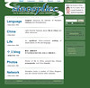
– Simple; almost all text
– Extensive use of RSS feeds to display latest content
– Javascript toggles to hide feeds and lists so that the page isn’t too long and cluttered with text
I think the problems are pretty apparent. It’s just so boring to look at. The javascript toggle just hid a deeper problem: too much info on the page. I’m guessing very few people ever clicked on the links to “open” the extra content for each section.
New homepage design:

– Tagline added (as recommended by DMMT)
– Graphical content teasers added (as recommended by DMMT), which rotate randomly on every page load
– Most feed-supplied content and many unessential links removed
It’s obviously just a lot more interesting to look at, and with the rotating graphics as well as the content from the blog RSS feed and the latest Flickr photos, seems a lot fresher. I still don’t have a concise welcome blurb, though. I also think there’s still too much text on the page. I’ll get to that stuff later.
Now that I’ve got the Tone Pair Drills done and the homepage redesigned, I’ll be spending more time on writing better blog entries (English and Chinese). I think it’s about time.
John,
I’m interested in designing web pages. can you recommend how I should get started in this by recommending some books or software?
Thanks
Greg
good question, Greg!
John, could you recommend something to us?
The new homepage is confusing and a bit overdetailed. Those tags probably could be in the blog rather than on the homepage. I would think you could work on the inside a bit more.As ususal, ppl still couldn’t know what have you written ever since you started this blog by just looking at a complete list.That’s annoying for me at least.you know, I had a hard time in finding certain entries that I’ve read before. I just couldn’t always remember the title of each.
Hi~~John,the douban team has introduced a new function–“wo shang”,aim to let the users collect and share the blogs they always visit. HOHO~~I added Sinosplice to it. _
Do U mind using ur photo as the logo?
Wow you dumbed it down and overloaded it with shallow sensory overload! Now it’s a bit overwhelming, but definitely flashier. I think it takes a little bt to get used to.
Greg,
I started seriously teaching myself HTML in 1998. I’m afraid the situation was much different then, and all the books and resources are different. The only resources I used were (1) the internet (it’s all out there, really), (2) Netscape HTML editor (I used it to make things like tables, and then look at the source code it created), and (3) a simple text editor (not Word!).
I often use W3 Schools as a reference when I forget something, but I don’t think it’s the best resource for learning from scratch.
Looking through some del.icio.us links, I found two tutorial sites that look decent: web design from scratch and HTML Dog. I’m kind of a purist; I like getting into the code. If you want to use software to make webpages, I hear that Nvu is good and that MS Frontpage is bad. Dreamweaver is probably too complex for an absolute beginner.
I hope that helps. Learning strategies that taught me the most were (1) experimentation and (2) looking at other websites’ source code.
Any other suggestions from other readers? John B? Micah? Anyone…?
Good luck!
marco,
How is the new homepage confusing? And I’m not sure what you mean by “tags.” Do you mean links? The blog is not the place for content that is not part of the blog.
I’m not sure what you mean by a “complete list.” There is no complete list. There are chronological archives, tag archives, and Google search. I find the combination of these three archives to be fully sufficient, and I’m not sure what else I would do.
Comet,
Heh, thanks. I don’t really mind you using that photo, although my hair is no longer that short, so I should probably change it.
trevor7744,
In what way do you find it overwhelming? Too much text, or too many images? I really don’t think the images are too much… I agree that there should probably be less text on the page, specifically in the “Language Resources” and “China” sections.
John, you haven’t update you blog’s Chinese versioin for quite a while, pay a littele more attention to that ,ok?
bel,
That’s part of the plan!
(Writing a Chinese blog has taught me–among other things–that blog readerships can feel neglected/jealous too!)
Like many regular readers, I’d venture to guess, I rarely stop by the front page at all – I rely on your postings here to let me know when things get updated in other parts of the site.
With that in mind, I’ll say that I don’t think I ever used the toggle on the old layout, if I even knew it was there. It may look more cluttered now simply because there’s effectively more usable information for people like me who wouldn’t think to expand the categories.
Also, the new layout may look more cluttered because perceptually, things sort of run together – you have the images on alternating sides, true, but you’ve gotten rid of the horizontal dividers and you have that section-crossing background watermark. I’m a big fan of judicious use of lines, myself.
In all, a nice update, in spite of the usual rendering problems Opera has with lists next to other content.
l’m sorry John, what do you mean by “That’s part of the plan!”? l don’t really feel jealous or whatever, l just thought it might be good to write a bit more Chinese since you are learning this language, and l seldom read your Chinese version. writing with a bilingual ability is pertty cool. By the way, your blog has become kind of a sensation among my classmates, the do enjoy it!(l recommended it to them) Thank you! We all think that you are really creative and intelligentand and have a child-like enthusiasm and curiosity!
Mr. John, two things:
1) Why does it say ‘try to understand China’ and ‘Learn Chinese behind the sinosplice log?
2) Are you using wordpress for the whole site or just this /life/ part ? I was thinking of building a whole site using different templates for pages and blog posts etc.
Gorgeous! looks cooler 😉
Oh btw, my Blog Service Provider just changed domain, I’ll appreciate if you could update the link. (simply .cn to .com) Thanks a lot LOL
and… yes, i like the banners of your network…
John, After reading thru some of that stuff, I think I will leave that stuff to you and just hire you to create the web page that I want. I would rather have a nice professioinal looking page that is done right vs me making something that doesnt get the appropriate message across to the intended audience.
Thanks for the suggestions tho.
@ ash
CSS can define different displays only in one template… well… PHP CSS 达人 to give a speech?
Two thoughts: (1) Ash makes a good point in comment #1. (2) You might want the categories on your header to mirror those on the front page so that everything is accessible from everywhere.
zhwj,
Thanks for that input; I’ll consider putting the lines back. I also feel it’s too cluttered; I’m going to remove some of the text.
bel,
By “that’s part of the plan” I meant that I am already planning to write more in my Chinese blog, which was why I ended the blog post by saying, “I’ll be spending more time on writing better blog entries (English and Chinese).“
I’m glad you all are enjoying my Chinese blog. Maybe someday it will go beyond “child-like” in its appeal…
ash (and trevelyan),
1.) That’s the tagline. As I mentioned, DMMT recommended having one. That was what I came up with. I chose to add it to every page because I think the ideas there apply pretty much to every part of the site. (Plus that’s what you often do with a tagline.)
2.) I’m not using WordPress for the whole site, but I’m using PHP includes for most of the site, many of which are also used in my WordPress templates.
kastner,
Thanks! Will update that link shortly…
Greg,
There was a time when I would have welcomed web design work, but I’m not sure if I can find time these days. E-mail me and we’ll see.
trevelyan,
Yeah, this is a good point (and it’s also one mentioned in DMMT).
I write “Language Resources” on the main page because it’s clearer than just “Language” and that one extra word saves me from needing a description like the other sections have. That space at the top is precious because it determines what’s “above the fold” and what’s not.
Then there’s the Network section at the very bottom. I really don’t think that it needs to be in the top menu, and there’s no space for it anyway. Maybe if I ever redesign for a wider layout I could consider it…
And then there’s the order. If I reorder anything, it will probably be the universal top navigation to reflect the order on the homepage rather than the other way around.
I’ll definitely consider killing the tagline or just putting it somewhere else. It adds way too much text clutter to the individual archive pages of the blog (just scroll all the way up and take a look).
Thanks for the feedback. If you have more, let me have it!
John, love the redesign. Especially the graphic parts to the classic posts. As one that might say they share your pain in Web design, kudos man. Great looking site – though I agree that some sort of dividers (horizontal rules or a graphic) should be put between the different sections to break up the flow a bit.
Thanks also for the DMMT link. With Lost Laowai under redesign, this is exactly the info I need.
John, why do you hide your tagline – perhaps make it white with a bold typeface?
I dig it. I think it looks more professional.
I think the new style’s a bit heavy on the images! I never have liked the really image crowded sites such as Yahoo! or Sina a much as minimalist, text based sites such as Google or Reddit. The other thing about having so many images with 3-D shading or effects, is they make the main entry blocks and the sidebar blocks look kind of “flat” in comparison.
I’m torn on the divider bars. The did make the page look more organized, but they also cost space. The “Try to understand China. Learn Chinese” part is great! that pretty much sums up your site. I don’t really see anything of value being added by “out of Shanghai, China…” though. If I could take anything out (except for some images), it would be that line.
I also second the recommendation for Nvu. It’s easy to use, and the code it generates validates.
Eh? Where’s the 中文 blog??
Greg, I second John’s recommendations of Nvu (and a plain text editor too), Web Design from Scratch, and HTML Dog. Brainjar.com helped me a lot with CSS positioning too (don’t worry about knowing what CSS means yet). The real important thing is to actually know the purpose of your web site. That may sound stupid but it is the real obstacle to creating a good-looking and coherent site. I wanted to pull out my hair when a previous employer told me to make a web site “because we should have one.” It was a big frustration to create, and a big waste of my time since they had no purpose defined for it and now it sits there. A clear purpose and good organization will keep you interested in maintaining it too. That’s why mine is down lately – the purpose is to practice HTML and CSS skills, which is a good purpose to do the work by hand but not a good purpose for the actual web pages. It doesn’t exactly direct me and motivate me. John’s doing something great with Sinosplice and he must know it because it has held his interest. 🙂
i sometimes felt confusing when too much info has been provided at a limited space. what i meant by a complete list is something like:
12/12/06 not making you think
12/23/06 My last X’mas
…….
something that you can track easily
Just FYI…..
overall, good design and more professional than before
ash,
Ah, sounds like you need to reload. I changed the stylesheet, and you probably have the old one cached. See the screenshot for how the tagline is supposed to look. (Tested on FF and IE.)
Thanks, everybody, for the feedback! I got a lot more than I imagined. I’ll be implementing some of it soon.
Hey John,
I guess this one may be off-topic because I can’t think of any issues I have with either layout, but from this post (guess I wasn’t paying attention), I found the tone-pair drills. I browsed it a bit online and when I get back from school I’m going to seriously go through it as a really needed refresher.
It looks awesome though, and I just wanted to say thanks 😀