It says 西湖一號 (West Lake No. 1). This is a good example of mainland Chinese designers using traditional Chinese characters for artistic effect (號 rather than 号).
According to 中华人民共和国国家通用语言文字法, such circumstances can use Trad.Chinese characters,
(一)文物古迹;
(二)姓氏中的异体字;
(三)书法、篆刻等艺术作品;
(四)题词和招牌的手书字;
(五)出版、教学、研究中需要使用的;
(六)经国务院有关部门批准的特殊情况。
西湖一號 is applicable 😛
by the way, we call the design 美术字
and nice picture, thanks John!
I guess they probably say West Lake #1 because China has thirty something different lakes all called “West Lake.” Our token lake in Fuzhou is also called West Lake. It’s pleasant and dates back to the Jin Dynasty, but not as nice as the one in Hangzhou. Is there an East Lake anywhere?
I’ll bet you a few mao that the architecture firm for that building is from Hong Kong. A mainland designer would not be so subtle with the colors, it would instead be a big red banner. ;p
I’m in Taiwan, and often see the font variation known as Cute Traditional in advertisements and comics, which I think is supposed to resemble the handwriting script of third-graders. The squared part of 見 is an oval with two lines inside, 日 is a circle with one line, and the square part of 可 is also a circle. There are actually no straight lines at all. I do not enjoy trying to read it!
i was born in taiwan, too
and learn chinese brushpainting
here in the states.
i find the simplified version
of writing to be such a shame–
i think traditional characters have
a history and art to them.
i guess i’m biased.
does this mean that a person
who has only learned simplified
chinese cannot read traditional?
i would assume that the really
scholarly in china still learn the
traditional form, as both corean
and japanese written language
evovles into chinese characters
at the highest levels, no?
That’s interesting….but come to think of it, 西湖一號 really is not applicable. It is not (3) artwork, and it is not (4) as a 招牌 but not 手书字. Unless it is (1).
Dheera’s answer is a good overview of generally used typographic families, and I want to expand on it briefly in the “anatomical” mode that is often used to analyze typography of the Roman alphabet. As with any writing system I can think of, the bas…
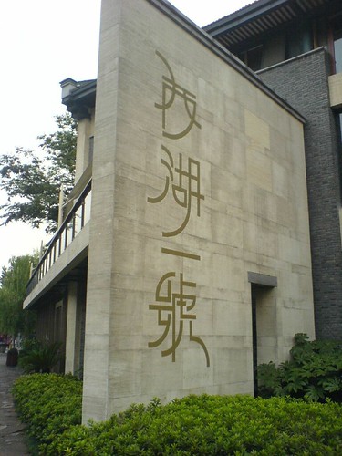
That’s an interesting mix. I wouldn’t have recognized the traditional form of 号. At first glance I only noticed the 虎 portion.
I take it you’re showing your parents the beautiful sights of Hangzhou now?
I do hope you’ll be sharing your family’s impressions of China when you have time.
According to 中华人民共和国国家通用语言文字法, such circumstances can use Trad.Chinese characters,
(一)文物古迹;
(二)姓氏中的异体字;
(三)书法、篆刻等艺术作品;
(四)题词和招牌的手书字;
(五)出版、教学、研究中需要使用的;
(六)经国务院有关部门批准的特殊情况。
西湖一號 is applicable 😛
by the way, we call the design 美术字
and nice picture, thanks John!
Ahh, so pretty but so much harder to read. It’s like trying to read a graffiti artist’s tags.
I guess they probably say West Lake #1 because China has thirty something different lakes all called “West Lake.” Our token lake in Fuzhou is also called West Lake. It’s pleasant and dates back to the Jin Dynasty, but not as nice as the one in Hangzhou. Is there an East Lake anywhere?
Ben – I’ve been there a lot. As far as I know, there’s only the one West Lake…. 🙂
Ben, aren’t all the other West Lakes in China named after the Hangzhou one? I can’t remember when I read that.
I find stylised Chinese(like that) really hard to read.
Easy for me so I think the designer didn’t take non-Chinese speaker into account when creating the cool sign.
I’ll bet you a few mao that the architecture firm for that building is from Hong Kong. A mainland designer would not be so subtle with the colors, it would instead be a big red banner. ;p
I’m in Taiwan, and often see the font variation known as Cute Traditional in advertisements and comics, which I think is supposed to resemble the handwriting script of third-graders. The squared part of 見 is an oval with two lines inside, 日 is a circle with one line, and the square part of 可 is also a circle. There are actually no straight lines at all. I do not enjoy trying to read it!
–scott
i was born in taiwan, too
and learn chinese brushpainting
here in the states.
i find the simplified version
of writing to be such a shame–
i think traditional characters have
a history and art to them.
i guess i’m biased.
does this mean that a person
who has only learned simplified
chinese cannot read traditional?
i would assume that the really
scholarly in china still learn the
traditional form, as both corean
and japanese written language
evovles into chinese characters
at the highest levels, no?
chinese font lover here. nice work i must say.
Kastner:
That’s interesting….but come to think of it, 西湖一號 really is not applicable. It is not (3) artwork, and it is not (4) as a 招牌 but not 手书字. Unless it is (1).
What is typography like in China?…
Dheera’s answer is a good overview of generally used typographic families, and I want to expand on it briefly in the “anatomical” mode that is often used to analyze typography of the Roman alphabet. As with any writing system I can think of, the bas…