Hand-written Menus
Micah posts some scans of an attractive hand-written menu for 老克勒.
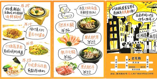
[link to full size]
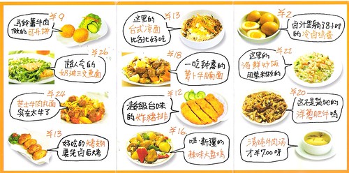
[link to full size]
Note: the names of the dishes (and most of the prices) are in orange.
As I mentioned in my Black Back post, I think learning to read hand-written Chinese is an important skill that’s not emphasized in textbook/classroom courses. Here’s a chance to work on that skill while also learning dish names (another common difficulty for the recently arrived).
nice! actually makes me hungry
ps: i like the font
I couldn’t agree more that reading handwritten Chinese should receive more emphasis in classrooms and textbooks. It is an entirely different skill than reading “regular” Chinese. I also think that understand Southern accents should be more emphasized as well.
Ben Ross: Totally agreed on the Southern accents! A couple of my classmates went to Sichuan and couldn’t understand much at all, and I’ve recently been listening to Peng Tan, and his accent is very different from what I am used to. It’s hard to make out what he is singing with that accent!
I guess I need to work on reading menus. Most of what I can work out is “tastes like the food Mother makes” and that kind of thing. (I doubt it tastes like what my mother makes, of course!) If it weren’t for the new vocabulary, I think I could make out the handwriting.
Unless, like me, you live in the south of China, and need all the help you can get deciphering Northern accents.
This menu isn’t too difficult to read (though I don’t know some of the characters). I have an incredibly difficult time reading handwriting–my wife has to take her time when writing things out for me to read. I had to stop going to the university cafeteria last year because I couldn’t read anything on the whiteboard, which forced me to order one of two things that I knew they had.
That “handwriting” is fairly clear. It’s things like this we’re up against.
http://liuzhou.blog-city.com/granny.htm
I have to say, I’m kind of amused that some of you seem to think it’s a font. Compare the same characters at different places on the menu. They’re not the same. It’s simply not practical to make a new Chinese font for something like this, and this is clearly not one of the 10 Chinese fonts that gets used everywhere.
Liuzhou Laowai: Yeah, this handwriting isn’t the most difficult in the world, but beginners gotta start somewhere…
After giving the handwritten chinese some thought, I would say that teaching the principles behind these archaic styles to beginners of handwriting chinese may be counterproductive.
In the stage while they’re still trying to get the right sequence and stroke direction, would we want to introduce to them things like Lishu, Xingshu and Caoshu etc.? Some of these operate on different stroke orders that go against Kaishu. Students will be terribly confused.
Furthermore, I think for people to learn how to read these, they must learn how to write them first, because that will allow them to understand how certain strokes could be written that way, facilitating quick recognition. Again, I don’t think we want students to be coping with different styles of chinese characters at the same time.
so funny. we’re all so used to computerised stuff that when we
see something like this we think ‘wow’. haha
I thought it was fairly obvious that it wasn’t a font. Just look at the phrase “妈妈.” The two characters don’t look exactly the same. I actually have a font that looks kind of like this, but, as you said, this isn’t a font. I have a bunch of weird fonts on my computer, though:
http://www.flickr.com/photos/26870209@N08/2916288628/
Apparently, people really do waste their time coming up with fonts that look like handwriting!
gigi, Concuerdo contigo !
When I was in Beijing in 2000, I picked up a book at the Xidan Xinhua bookstore that I found very, very useful. It was called something like “3SMSH Handwriting System” and it went through about 60 characters that were representative of this handwriting style, teaching you the shortcuts of writing those characters, showing good/bad examples of handwriting for you to distinguish between, and giving lots of examples to trace/practice writing yourself. I chose this book out of a range of handwriting-style books because the writing style was modern and seemed representative of the style that I saw around me most in use the by other people, so it really helped my “handreading” comprehension as well. I’ll see if I can find it when I get home and post some scans. I would really recommend it for intermediate level Chinese learners.
I’d have to agree with some of the commenters and say that this is actually some pretty good penmanship. Looks like someone took time to make sure that it was readable and yet still personal for this menu. I guess if you’re just beginning to take steps into reading hand-written Chinese, this would be the way to go.
Most hand-written notes I read, however, are never this nice. Most difficulty arises for me when people lazily connect lines within a character to speed up the process – it ends up looking like one big scribble.
You don’t need to learn to “decipher” something that even natives can’t read. Haha, just joking!
I very highly recommend Chinese Cursive Script: An Introduction to Handwriting in Chinese by Fang-yu Wang:
( http://www.amazon.com/Chinese-Cursive-Script-Introduction-Publications/dp/0887100333/ref=sr18?ie=UTF8&s=books&qid=1223324109&sr=8-8 )
Before too long you’ll be reading from the Whiteboard linked to by Liuzhou Laowai.
Found your blog because I was bloghopping everywhere. And I must say, I’m truly enjoying the read.
This is my first comment here (I don’t think it will be my last)… I was particularly drawn to this post because of the food—-plus the artistic way the menus were made. It’s amazing how old skool mano-a-mano graphic design still shines through despite the technology age. It looks so neat and pretty! 🙂