The new Sinosplice Design is up!
I’d like to say thanks again to Ryan of Dao by Design for all his hard work in this Sinosplice redesign. Much of the work that went into the new site was “under the hood,” as Ryan worked out ways for me to move my “WordPress + static file hybrid” site into a modern, fully CMS-managed website. Now I can do everything (all sorts of updates) through the WordPress admin panel, which is enormously convenient. Furthermore, Ryan was really patient and professional about letting me try out some of my ideas. Some of them turned out to be deadends, but I’m really glad I got to try them out. Most often the end result was a design that was simpler, which is certainly a good thing.
One of the goals of this redesign was to make it easier to interlink blog post content and non-blog content, particularly the language-related content. Although this redesign has already done that to a greater extent, the stage is set for me to organize the content much better for the casual visitor.
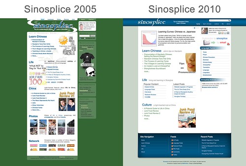
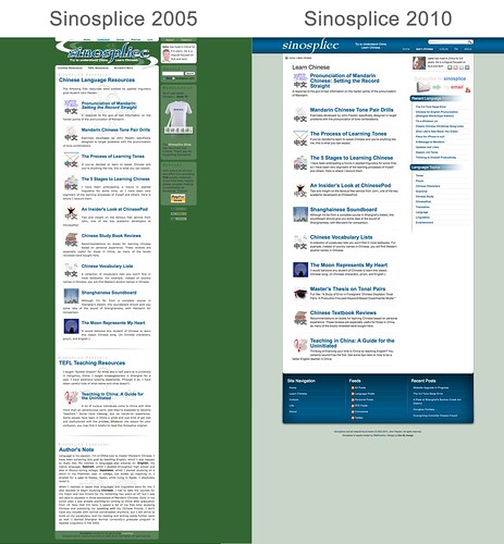
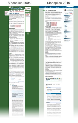
Now, here are some “before and after” comparison screenshots for fun:
The home page:
The “learn Chinese” page:
A post page with comments:
So the site is now completely off of DreamHost and on WebFaction. I’d be interested to know if anyone finds it faster or slower. Please also let me know if you discover any issues, particularly missing files and bad links. Thanks!
Site redesign/facelift looks great. I can’t believe the old one was from 2005. It looks even older when compared to the new design. You were overdue I suppose. Again, the new design looks great.
Very clean and easy to navigate. Nice job!
Glad you guys like it! It feels like a breath of fresh air to me. Many have said that it almost doesn’t feel like Sinosplice without the green, but I think I’m ready for the change…
Beautiful, clean lines, and easy on the eyes, John 🙂 It’s very nice. Nice font. Love the blue.
Well, I guess I have to go back and change the “John Pasden Green” crayon… Or maybe it’s more collectible now as a nostalgic piece.
Site looks really good John.
Nice refresh! 加油!
Wonderful new design. The blue is very nice and soothing to the eyes… And the green… Hate to say it, but it was AWFUL.
Anyways congrats for the new lovely design
Hehe… Yeah, I’ve heard that before. Can’t say I completely disagree, now that I have this.
Yeah I quite like it John. Congrats to you and to Ryan… well done!
Is that an embedded comment just there? Now there’s a feature. I will miss the J.P.Green a little bit, but it looks lovely anyhow.
Wow, what a change! I had the same feeling some others had mentioned. It almost feels like it’s not Sinosplice anymore. On the other hand, I rarely chose to read the old version in green and I can see how some would be happy to see something lighter. One other thing I like is how the Tone Pair Drills and similar pages feel easier to navigate.
Like the new site. Well done.
Glad to see the “time in China” counter is still there. I enjoy that “prisoner marking off his sentence” feel.
Looks good…much brighter than the old one. Ryan does some nice work. I should save some money and have him redesign my site.
Hey John,
Love it, love it, love it – great design. I’d like to hear even more about the back-end stuff (no pun intended). I’m due for an change myself, but not being so savvy, it’s going to consist of a WordPress upgrade and a theme change.