Retiring this Layout
I’ve been using this blog layout for some time now, and it’s comfortable. I’ve gotten some complaints about the green, but for the most part I ignore them. It’s true that this color doesn’t look good on some people’s monitors, but it looks good on my monitor, and I like it. However, the reasons to change my layout are starting to pile up, so I finally did a redesign, keeping the elements of this design that I like. The new design will go into effect next week.
Warning: what follows is an extended discussion of the current layout which you are likely to find extremely boring. I’m recording this to keep a record of my own thoughts about my layout more than anything else. If you’re too cool for or have no interest in such a geeky topic, then by all means, stop reading now.
For a lot of reasons, I’m going to miss this layout. There aren’t a ton of 3-column layouts out there, and I like the symmetry. I also like how at the top, the left side is a picture of China (each picture linked to its respective photo album), and the right side is a picture of me, and they fade into the Sinosplice logo, under which is the blog contents. Cheesey? Regardless, I like it.
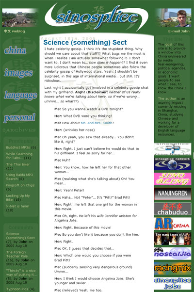
Then, with the exception of the “menu buttons” at the top, the left column content is all basically blog-related. The right column content is mostly related to the rest of my site. Pretty clear organization, I think.
OK, now for the bad. There are a lot of reasons to ditch this layout. The main ones are:
1. This is a weblog, not the whole site. I want this page to be the “Sinosplice Weblog,” not “Sinosplice.” The name is unimportant, but the distinction is not. This weblog should not be the only significant content of the site. Thus, I will be adding more content to other areas (especially the Chinese language learning resources) and designing this page to be less of a “hub.”
2. Too many unnecessary images. Images increase load time. The menu buttons (including “Archives,” which also seems stylistically off-kilter) at top left are unnecessary. Even more unnecessary are the big loud buttons in the lower right. They just give the page a cluttered, busy feel. Plus a lot of the sites they promote have sort of gone by the wayside.
3. I want a wider main column. It seems like images are so often 500 pixels wide (notably: Flickr‘s images), but I can only do a little over 400 with the current layout. 500 pixels seems ideal. That means that if I want to keep the new design uncluttered, there can realistically only be one other column. I’m OK with that.
4. The description of the blog needs to go. Currently, it’s: “The goal of this site is to provide a window into China unsmeared by media fear-mongering, political agendas, or economic goals. I want people to see what I see, to know the China I know.” It sounds nice and all, but I think it’s a little too pretentious for my taste. Also, it makes my blog sort of sound like an alternate news source on China, which it’s not. At all. In the absence of any clear goal for the blog, I can just update that space with a short sentence or two covering what I’m doing in Shanghai now. All the wordy details can go on the about page (which will get a makeover of its own soon).
5. Google AdSense unfriendly. For about a year now, I’ve been experimenting with Google Ads. I still refuse to whore out my blog by plastering ads all over the front page, but I see nothing wrong with putting ads in the archives to earn a little revenue from the visitors that come in through Google. Unfortunately, the current column widths make it hard to place ads effectively and attractively.
So there you have the basic reasons I’ll be retiring this layout. Next week you can see what I’ve devised to replace it. The change will not be too drastic.
Very interesting. After you detail the layout of this website, it actually looks a lot better. It “makes sense” when you say what your goals are of this layout. So, that said, after the new layout goes up, can you talk about why you went with that design?
i’ve always liked the layout of this site…it’s pretty cool…
So you’re reconsidering this, then…?
I just noticed those little music/games buttons on the left side of the comments pages – that kind of small, unlabeled stuff is kind of cool.
Scrappenthal,
Don’t worry, I’ll be doing just that.
zhwj,
Believe it or not, that was my starting point. But the new layout doesn’t look anything like that.
I’ll consider having more little unlabeled buttons (or something similar).
Thanks for sparing us “non-techies”.
those sound like the kinda nit picky reasons that only the creator could notice – I know the feeling 🙂
Are you gonna go with that Sinosplice test site you showed me a long while back or something totally new?
John,
Since you are not going to be using this layout anymore, can I have it?
Pketh,
Naw, I scrapped that one entirely long ago. This is a new one.
you know, john…
i have always admired how you have these distinctive tastes about what qualifies as an attractive website. i would like to know what other websites out there you think are good examples of design. (one example would suffice.) insofar as “sinosplice,” am i to understand correctly that you are changing the current design to relfect the fact that this is more of a website as opposed to a blog? or are you going to shift the desgin to be more blog-centric and eliminate these other links? (p.s. i love the green. for whatever that’s worth.)
Illy,
That’s a good question… I’m not sure. I see designs I like all the time, but when you ask me to name one, I have a hard time. Designers’ websites usually look pretty good. Like this one: http://www.stopdesign.com/
Part of the thinking behind the redesign was that this blog should not be central to this site. I want it to be a part of the site, not the site. When asked, “what is Sinosplice?” I don’t want most people to answer, “a blog.” Right now, I wouldn’t blame anyone for answering that way; this blog is certainly the part of the site I put the most time into. But in the future I intend to expand this website’s offerings.