A “Home” for Escher in Chinese Design
Here’s a poster I spotted in a mall recently:
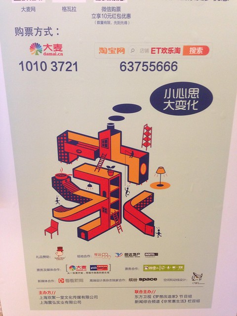
The character there is 家, meaning “house,” “home,” or sometimes even “family.”
The first thing I noticed was its Escher-like quality, updated to a modern aesthetic. (Reminded me of Monument Valley even more than Escher directly, actually.) Very cool, and not something I see much in China, for sure!
The second thing I noticed was that the stylized character on the poster is missing a few strokes. If this character is 家, then the bottom part is supposed to be 豕, which has 7 strokes. Instead, the bottom part looks more like the 5-stroke 永, minus the top stroke.
I found this odd, because this is a pretty big difference, and in my experience the Chinese don’t take character mutilation too lightly, especially when it’s not just private use. My wife’s response was just to shrug it off, though, with a, “yeah, but it’s still supposed to be 家.”
What do your Chinese friends think? Cool design, or heinous affront to the sanctity of the 10 strokes of the Chinese character 家?