Does This Font Make the Character Unreadable?
I’ve been seeing this app icon in ads around Shanghai recently:
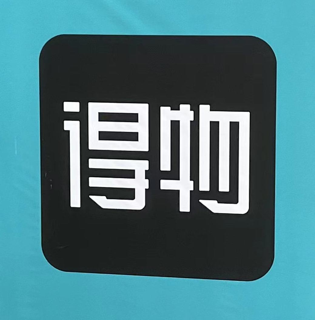
Can you read it? Specifically, I want to focus on the character on the left.
Whether you can read it is all about how you parse the different parts of the character. Clearly this structure is of the overall form ⿰, with the right half further breaking down into ⿱. Pretty standard.
Top right looks like 日, so that seems fine. But what about the left side and bottom right?
Left side looks most like 讠 (言字旁) to me. Maybe 氵 (三点水), since those bottom two strokes are sometimes run together. What it does not look like to me is 彳 (双人旁). But that’s what it is.
Bottom right looks like a deformed 于, and even reminds me of 毛 (but it’s clearly not that). However, it’s actually 寸 (with a stroke above it), and the 日 above is actually part of 旦. That’s quite a bit of stylization.
So the character on the left is 得 (dé). The app name is 得物 (Déwù).
I asked some native speakers what they thought about it, and their reactions ranged from “it is hard to read” to “it’s just a little artsy.”
This is the most egregious of “stylization making a character hard to read” that I’ve run into in a while. For me it was difficult to read, but guessable. But evidently non-native speakers are cool with it.
Easily guessable, even though I wasn’t sure because I didn’t know about the app and suspected it’d be a trick question or something. 🙂 I think the only thing that really makes it hard is the 彳 bit, which I only identified based on what’s on the right, which is legible enough.
Definitely a tricky one, that 🙂
I actually guessed 得物 when I first glanced at it. But after looking at it and trying to actually see how the left side could be styled as 得, I couldn’t and figured I was way off. Definitely “egregious”
This is immediately readable to me; I think what makes it “counts as correct” for me is that the stroke order is maintained; so even though the entire top of 彳got simplified into one blob, it stayed together so I’m ok with it? And the 物 also simplifies two parallel strokes into one, so it looks stylistically consistent to me.