Deconstructing the Chinese Character Creativity of Japan
Pink Tentacle recently did a post showcasing Japanese town logos which make prominent use of kanji (Chinese characters in the Japanese written language). These designs totally blew my mind. I love seeing creative manipulation of Chinese characters, so this stuff was pure gold.
Be warned, though; some of these are a bit hard to make out if (1) you don’t know what character(s) you’re supposed to be looking at, and (2) you don’t have significant experience with Chinese characters. Below I’ll explain a few of the designs to make them a bit more accessible.
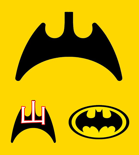
I’ll start easy. This one is cool because it’s not hard to make out, and it has an easily recognized source of inspiration:
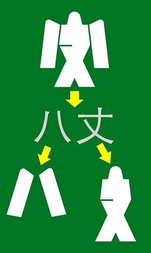
This next one is actually two characters, but both are fairly easy to recognize (they’re just a bit chubbier than usual), and they have the added benefit of resembling a Japanese robot! Nice.
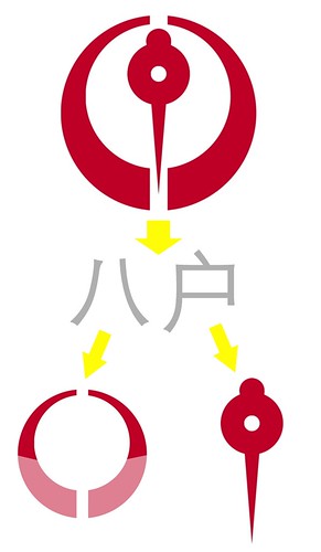
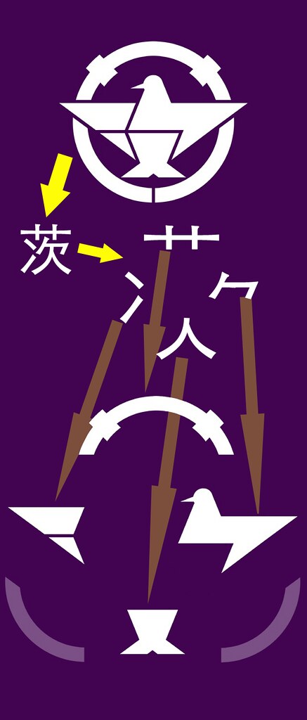
Two characters again (八 returns!), but this time a decidedly asymmetrical character is forced into a symmetrical design, with interesting results.
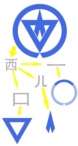
Now we’re getting a little crazy. This very stylized logo turns a line into a circle and a box into a triangle. It takes a bit of mind-bending to see it.
This one is probably my favorite (overlooking any similarity to the logos of past fascist regimes).
So it turns out learning character components can have interesting applications after all. Be sure to check out all the other logos on Pink Tentacle. There are plenty more good ones.
Very cool deconstructions.
Being a bit of a vexillophile, I’d come across these before, which pretty much set me on the search for regional Chinese flags. No such luck outside of Hong Kong, Macau and (formerly) Harbin. Too bad too, since obviously so much coolness can be achieved with this sort of thing. I’ve always been impressed that they managed to keep some aesthetic consistency in all of these, as compared to US state flags.
The thing I wonder is do they see the characters in these like we see the letters in tacky Latin based logos (e.g. China Citic Bank or the Greek orthodox ΧΡ for ☧), and if so, does that detract from the design we as non-natives see? Probably not something a non-native can really ever know.
Cool. I don’t suppose many Japanese would be able to get it without the help of these diagrams.
Similar to this, have you seen the Carrefour sign for home delivery where the 到家 characters are turned into the shape of a delivery van? I that one is really clever, and it has the advantage that it is self explanatory because you can still see the characters pretty well.
That definitely is cool, although I will readily admit that I probably wouldn’t have found out the characters without the explanation below.
On a related note, didn’t you have a post about something similar where Chinese characters and English were mixed. What are those dong xi called? I have been searching your blogs for quite some time and just can’t find them:)
Wow, they look pretty cool, but I find them pretty difficult to decipher.
http://www.stitchzone.com/images/custom/lfe_kanji.jpg
This is one of the logo for Lambda Phi Epsilon, which is one of the Asian fraternaties in the US. They used the greek alphabets for lambda phi epsilon to look like chinese characters which looks like ren zhong wang (人中王), which I’ve always thought to be pretty cool.
Hi John
Thanks a lot for the nice article, as usual. I’m very happy to find the logo of my hometown in Japan in the page by Pink Tentacle. I didn’t know at all that the logo was made FROM Chinese characters. I believe the same holds true for most Japanese people who live in the cities that have Hanzi-based town logos. In short, “who cares?”, hehe.
[…] Deconstructing the Chinese Character Creativity of Japan John Pasden @ https://www.sinosplice.com […]