Characterception
Spotted near Zhongshan Park in Shanghai:
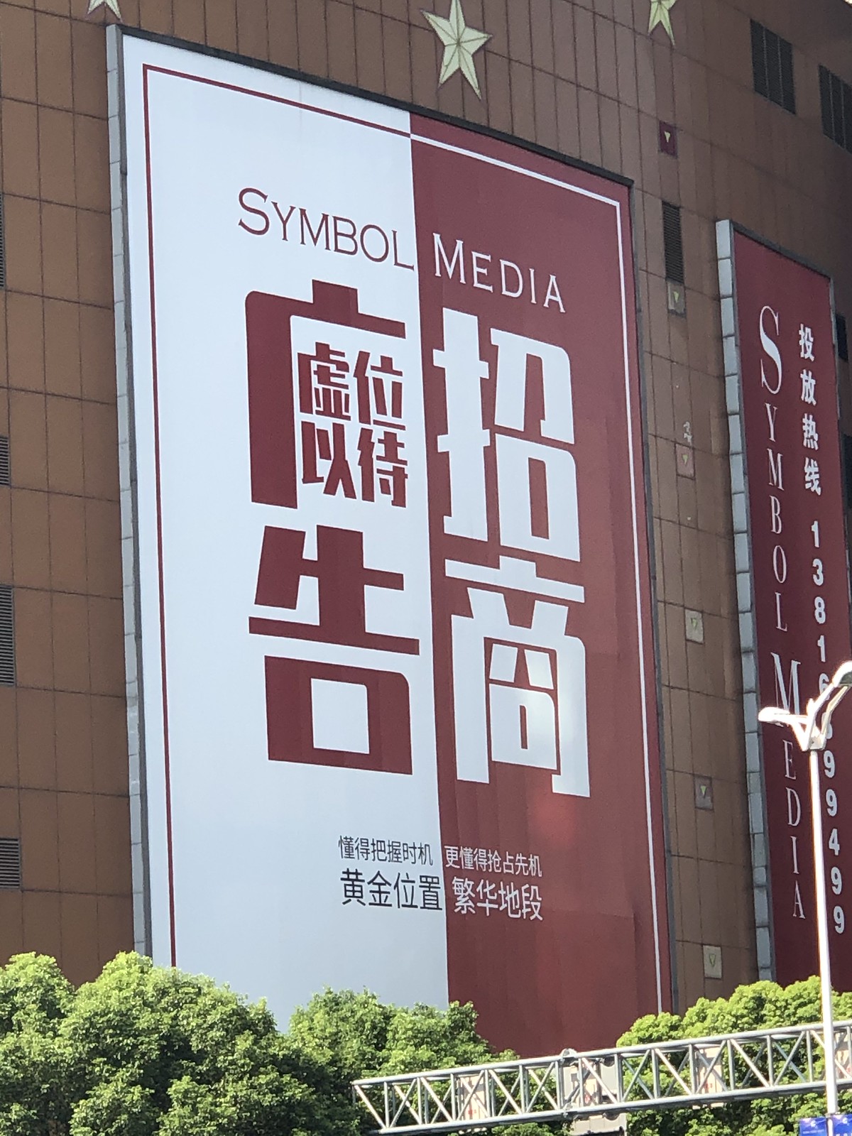
Big text:
广告招商 (guǎnggào zhāoshāng) advertisers wanted
Characterceptioned text:
虚位以待 (xū wèi yǐ dài) spots currently available
But what’s perhaps most interesting (infuriating?) about this ad is the way that this text is read…
- First down the left column, then down the right (广告, 招商)
- Then left to right across the top, then left to right across the bottom (虚位, 以待)
Have you ever noticed how hard it can be to figure out how to interpret 4 characters in a 2×2 grid? If you don’t already know the phrases used, this kind of text layout is super hard to read. That’s because there are three possible ways to read the 4 characters:
- Left to right, across the top (modern horizontal)
- Top to bottom, left to right (modern vertical)
- Top to bottom, right to left (classical vertical)
This example is particularly egregious, though, since it mixes two orientations, and the phrase “广告招商” could also be understood as “招商广告”.
P.S. This ad wouldn’t work in traditional Chinese, because 广 (guǎng) in traditional is 廣 (guǎng). No big loss, though!
Interesting!
Haha! We’ve made our logo into a 2×2 grid like that and Delicia (the youngest sister) pointed this out. She said, “it could be this way or that way or the other way!” We still like it though, it reminded my father of booksellers in his time. 🙂